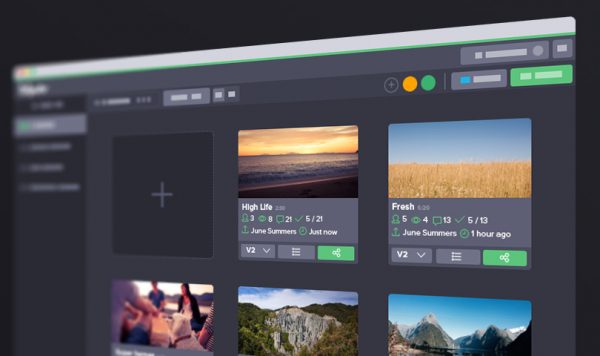
Recently Wipster announced integration with Vimeo, and they have also made several other major upgrades to the user interface, including a redesign of the projects screen.

You can now view your projects in a thumbnail view. This view allows for more information to be shown in a smaller space and removes any distractions.
There is also a new projects list view for organizing high volumes of video.To access the projects list view you just click on the ‘view switcher’ in the subheader.

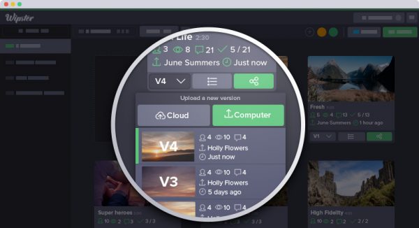
The other major change is the second iteration of the version switcher. The version switcher first made an appearance on the review screen late last year, it has now been redesigned and can be found directly in the projects screen. This gives you access to each of your versions and allows you to stack a new one right on top.
New features in this release:
Redesigned video thumbnail view
Projects screen list view
Projects screen performance improvements
Connect your Wipster account to your Vimeo account
Vimeo Look Folder allows seamless imports from Vimeo to Wipster (Vimeo PRO users only)
Publish videos directly to your Vimeo account
New Apps tab in Account settings
Wipster mobile performance improvements
New Version switcher on the projects screen
Team members are now notified when a video has been successfully uploaded
Upload performance improvements
Cloud import improvements
Real-time commenting improvements
Redesigned Shared with me
Redesigned Archive
Various bug fixes and other small enhancements
And a brand new favicon


