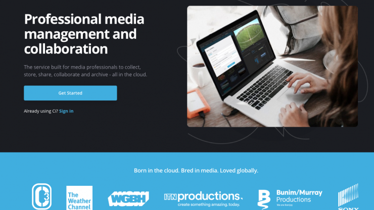
Sony has just released Ci 2.0, its cloud-based media utility designed to streamline content production and collaboration with teams.
You can learn more about the features of Ci on the Sony MCS website.
What’s New?
The key additions to Ci 2.0 include an updated global navigation panel, secondary filter panel, filters, folders and finders, a new action bar and a revamped search function.

Action Bar 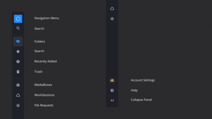
Streamlined Navigation 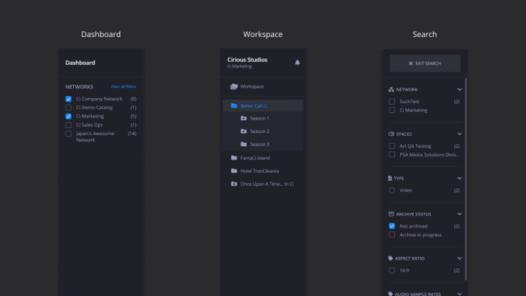
Filters, Folders & Finders 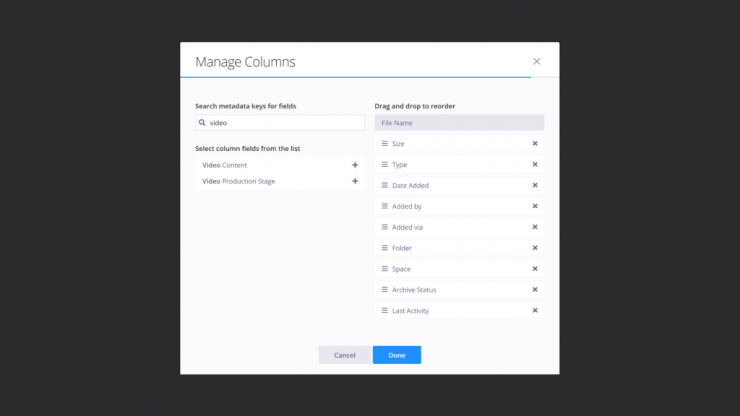
List View
See the full list of changes to Ci 2.0 below.
- A streamlined global navigation panel to meet all of your navigation needs. This new panel is the strip of menu options located on the left of the screen. We hope this new panel helps by making all of Ci’s major functionality available in a consistent and easy to find location. From top to bottom, the new navigation panel houses: Top navigation/Dashboard, Global Search, Folders, Favorites, Recently Added, Trash, Sent to External Target, MediaBoxes, WorkSessions, File Requests, Accounts Settings, Help Center and Collapse filter/folder panel.
- We’re rolling out a new section to the right of the global navigation panel that functions as a secondary filter panel. On the Dashboard, this filter panel allows you to select between Company Networks to discover Workspaces faster. Inside a Workspace, this filter panel serves as a folder tree area for you to navigate within your folder structures. We added styling improvements to highlight the folder you’re previewing so you don’t get lost in the folder tree. Inside the MediaBox, WorkSession and File Request management pages you can also filter by various criteria.
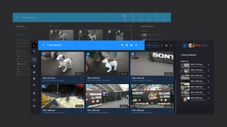
- Our Action Bar got a little nip/tuck but don’t be fooled by the petite form – it’s way more function than form. Note: all options in the Action Bar are also available in the right-click menu.
- The new action bar allows you to conduct critical functions like search even while having files selected in your content preview area.
- In the ‘More’ button (looks like a kabob without the skewer), we added the ‘Copy Elements’ but more on that later.
- Just outside the blue Action area, you’ll find the “Add New” button, a brand-new Sort menu, Viewing options menu, and an option to collapse or open the right context panel.
- When viewing your content in List view you can now access the ‘Manage Fields’ tool that lets you manage the columns for viewing AND sorting. Rearrange the fields by reordering the columns or personalize them by adding new fields. Customers with custom metadata templates can add custom metadata fields to the viewable columns. Contact us to learn how to set up custom metadata templates to your Company Network.
- Since we turned on the carousel preview of files, the ‘Preview folder’ option is officially retired.
- The Account Settings menu got some big updates:
- First, we moved it to the bottom of the global navigation panel on the left.
- We rearranged the menu to make room for a “New Ci Experience” section. Here, you’ll find a link to share direct feedback with us and the option to “Switch to classic Ci” if you prefer the original Ci experience. Note: The original Ci experience will be going away in the near future. If there are features you prefer in that original experience please let us know so we can work to improve your experience.
- In case you haven’t been paying attention, Ci comes in two themes – dark and light. You can come to your Account menu to toggle between Light (or Dark) mode for a personalized experience.
- Clicking on your avatar keeps the Account menu open even when you hover off the menu.
- Watermarked images can now be downloaded from a MediaBox!
- Recipients can download image renditions at a maximum height or width of 2000px. They are not able to download the full source file with a watermark burned in.
- Because of the complexities of watermarking we have to block some features such as Download All, Save to Workspace and Download with Aspera.
- For the recipients of watermarked video and image content, we added explanations about download restrictions on the MediaBox access page.
- Videos with watermarking are not available for download but that feature is coming soon.
- Improvements to the Action Bar and navigation as well as styling enhancements across the board for a better smaller screen experience. On smaller browsers (i.e. mobile devices) the Action bar appears on the bottom of your screen. To open the global navigation panel, select the navigation icon (looks like three bars) in the top left. In the Dashboard, you can select the Filter icon to filter through Networks. Inside a Workspace, select the folders icon to navigate through folder trees.
- Housekeeping across Ci to introduce the term “Spaces.” Spaces will play an important role in how we group Workspaces as we continue to expand Ci functionality in the coming months.
- In Small card view on the Dashboard, we removed the ‘Invited’ label to make sure the Network name is visible. The ‘invited’ label is still available in the Large card view.
- Our right-click menu got a makeover. We rearranged the menu to make ‘Favorite’ and ‘Archive’ easier to find and added ‘copy Elements.’
- You can now (micro)manage File Requests! The latest additions to advanced settings include: disallowing folder upload, setting Aspera as the preferred upload method, setting limits to the file type and the number of files contributed.
- Overhaul of File Elements
- You’ll now see an Elements menu on the left to quickly jump to a File Element section based on the file type.
- You can now create “Custom Renders” which are new videos transcoded in the file format of your choice and saved as a File Element associated with the original file. Contact us to enable or learn more about this feature.
- You can now generate frame grabs from videos that are rendered to the same dimensions as the source video, these are stored as file elements and can be set as the source file’s thumbnail.
- User-generated File Elements including video clips, frame grabs, and other user-added elements (i.e. custom renders) can now be copied to other files in Ci.
- The following Elements have been renamed and/or rearranged:
- Preview Files (Ci Proxies) renamed to Ci generated video previews
- Ci Thumbnail Elements renamed to Ci generated frame grabs (video) and Ci generated thumbnails (all non-video files)
- Filmstrip scrub images rendered from videos renamed to Ci generated images
- The expanded Elements functionality is supported in MediaBox so users can specify which Elements are available for download by MediaBox recipients. Yes, this means that custom renders can be made available for download via MediaBox too!
- Files and folders can now be sorted by Last Activity. File activity was always tracked in the Activity stream but now you can see the ‘Last Activity’ date in your context panel and in List view, you can also sort. Activities include any action taken on a file or any files within a folder.
- Thumbnail view options got two major updates:
- 1) You can select your preferred thumbnail size to fit more thumbnails on-screen and
- 2) you can choose ‘filled thumbnail’ so give your thumbnails a more uniform look or choose ‘maintain aspect ratio’ to see the thumbnail in the true file dimensions (i.e. portrait orientation).
- To better distinguish archived files, we’re adding a blue archive icon next to filename to indicate archived files. Files that are temporarily restored will be marked with a green restored icon.
- To better handle extra-long Workspace names they will now be wrapped. For long folder names, a tooltip with the full name will appear if you hover over the title. You can also drag to resize the folder tree panel to see longer names.
- To improve the first-time user experience, empty Workspaces now have two action-ready buttons: ‘Upload Files or Folder’ and ‘Create Folder’ and you can still drag and drop files directly too!
- To enhance the clipping experience, we added the clipping button to our playback control so you can launch the clipping tool without clicking the play button. Also, we added tooltips to the ‘create video clip’ modal to clarify when you should save a clip as a File Element of the source video or save it as a new file.
- When a file is added to Ci, a label (i.e. ‘uploading’, ‘processing’) appears to tell users the status of the file. To provide more details on the status of files, users can now hover over the info (i) icon next to the status label to get more information.
- To copy files even faster, users can now hold Ctrl + drag and drop to the target folder. And if you didn’t know you can always drag and drop to move files.
- We now support List view in Search so you can sort through results to find your files faster. If List view sorting doesn’t meet your needs, we are introducing the option to export to search results to CSV (icon next to ‘Add New’)
- Introducing Deep archive for even greater cost savings! Ci now offers Deep Archive in addition to our current Standard Archive. Contact us to learn more about Deep Archive and how much you can save with this feature.
- Most teams need the newest or latest version of a file for their projects so we’ve reset our default “sort by date’ order to descending across Ci. This means that content with most recent activity will always be at the top whether you’re looking a Workspace on the Dashboard or Files inside your Workspace.
Bug Fixes
- An unintended consequence for introducing the pagination of preview thumbnails was that files could not be selected across different pages. Users can now use shift + select to select files across pages.


