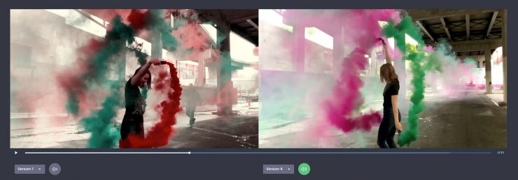
Wipster has just released a new side-by-side comparison feature that enables users to compare current & previous iterations of videos to compare progress and creative decisions. The release is an update to the version stacking feature inside Wipster.

We’ve achieved this and helped millions of videos get delivered faster. This addition lets you look at two versions of a video at the same time and compare the conversations. We think this is a very powerful update, and we hope you enjoy adding it to your workflow.
Rollo Wenlock, CEO and Co-Founder of Wipster.
How to Compare?

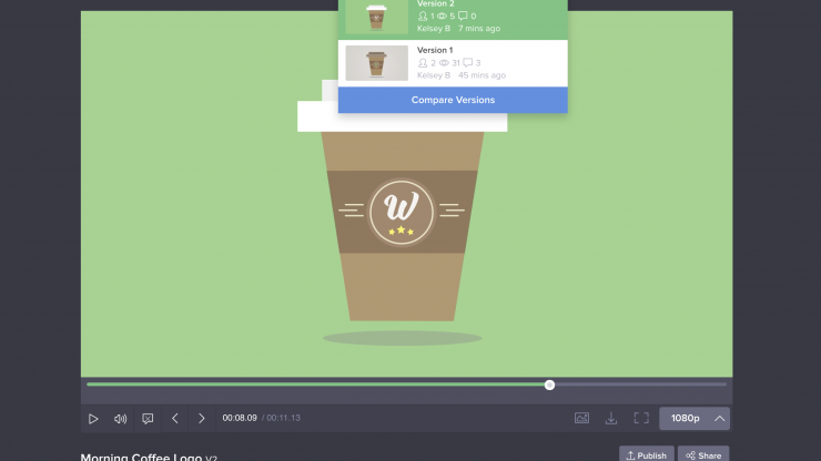
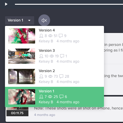
Comparing versions is as simple hitting a “Compare versions” button, and selecting the two versions you would like to compare.
Clickable and Visible Comment History

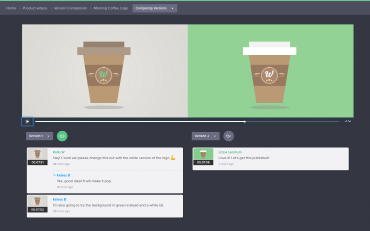
Once you select two versions, you will not only get the two videos to scrub through but a comment thread which timecode links. This helps to check progress, to see whether tasks were actioned.
Who can see versions?
Version comparison is only visible to your internal Wipster team. If you share a video with a reviewer outside your team, they will only see the version you sent them to review, approve, or preview.
Audio Playback

Wipster also implemented audio playback comparison with mute buttons so you don’t have two tracks playing along since they could be at different timings.
Sign up
If you’re interested in Wipster, you can sign up for their 14-day free trial to see if it’s right for you and your workflow.


