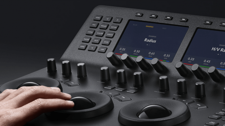
The DaVinci Resolve Mini Panel is an absolute delight to use. Even as I was still getting familiar with the layout of the controls it was already faster than the Avid Artist Color panel I’ve been using for the last 4 years.
Why bother with a control surface?
There are lots of good reasons to use a physical controller to do things with a computer that in theory can easily be done with a mouse and keyboard. For colour grading and sound mixing there is one overriding reason that control surfaces make such a big difference and that is simply that you often need to be adjusting multiple parameters while looking at the pictures rather than the controls.
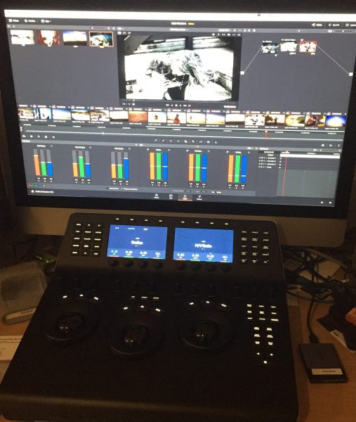
The DaVinci Resolve Mini Panel takes this to a whole new level with its convenient size, intuitive design and deep integration with Resolve. I recently had the chance to test the Mini Panel and was able to use it to grade our new Main Course Films showreel. This turned out to be a great test because it involved working with lots of different footage in different styles and in different formats so we used more of Resolve’s toolset than on a typical project.
DaVinci Resolve Mini Panel: First impressions
The first thing you notice when taking it out of the box is the build quality. It’s a solid piece of professional gear and while it is small compared to the full sized Advanced Panel, it still has a decent sized footprint on a desktop and enough space between the controls so that you’re not constantly bumping one when adjusting another.
Flexible power options
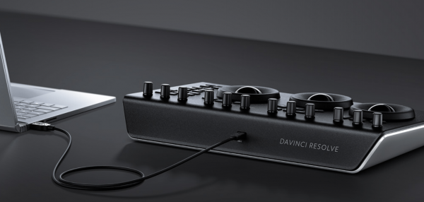
Unlike the smaller Micro Panel, the Mini requires its own power connection but this can be either AC or DC. The other side of this though, is that a USB-C powered laptop like the new MacBook Pro can actually be powered from the Mini Panel using the same cable as for control, making for a very clean and simple portable setup.
The process of getting the panel working with Resolve is as simple as you would hope for a piece of equipment that is dedicatedfor use with one piece of software. Once plugged in it’s simply a matter of selecting the Mini Panel from the list in Resolve’s preferences. Unlike some other control surfaces, I found that the Mini Panel and Resolve easily found each other again if the panel was temporarily disconnected.
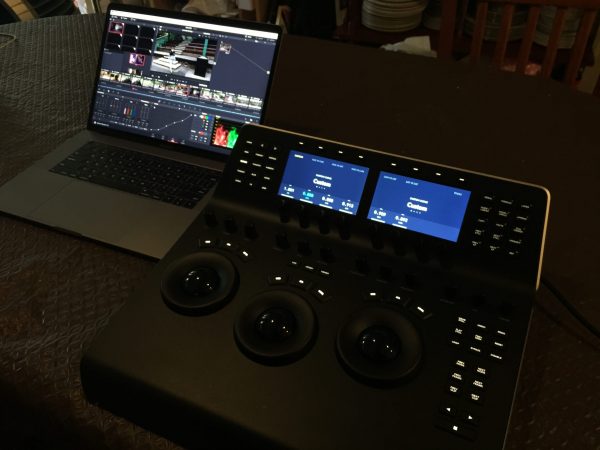
Although there’s a setup Application for the Panels and a page for user adjustments, there’s currently no variables in the setup so when the Panel is plugged in and selected it is instantly operational without any other tweaks needed.
Responsive, solid feel
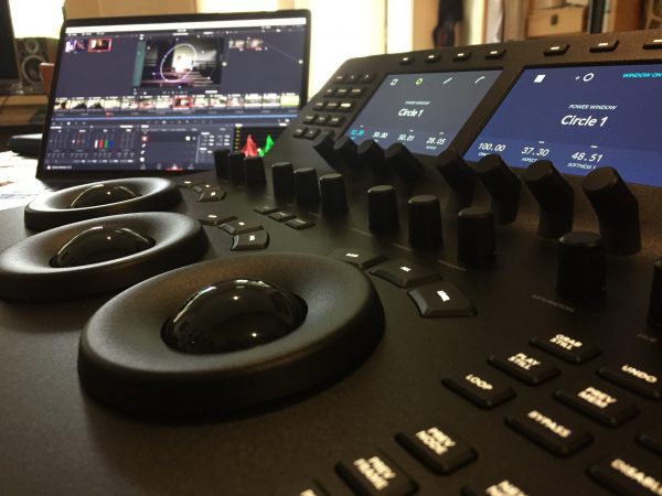
The three trackballs are smooth and precise to operate. They instantly feel right and even after four years of using another type of panel, I found myself quickly making just the right amount of adjustment. Another feature I love is that when you select the Primary page for the soft knobs on the upper section of the panel you can control the Red, Green and Blue levels using the dials. While this is actually doing exactly the same thing as adjusting the color balance using the trackballs, it’s great to be able to use either or both methods. For example, I found that I was quickly getting the overall balance right using the trackballs but then often using the soft knobs to make tiny adjustments with a more surgical precision. The level of speed and precision by using both types of controls is amazing and like many of the controls on the Mini Panel, I feel it encourages you to both experiment and refine the look.
The level rings around the trackballs are substantial and solid. They feel serious and have just enough inertia to get the right balance between smoothness and accuracy. It’s easy to grip and adjust them either from the top or the side and the fact that they are around the trackballs makes it quicker and easier to move back and forth between colour and levels as we always need to do in a grade.
Not all about the color. Or Colour.
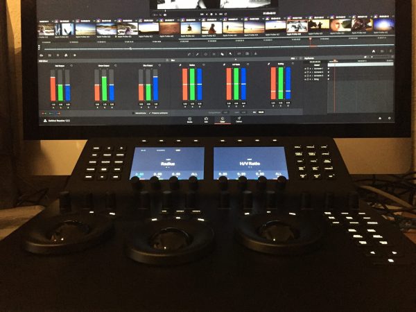
Because of the terms “Color Grading” or “Color Correction” it’s easy to get too focused on the color controls and overlook how much of the work of the colourist is actually focussed on getting the balance of the brightness and contrast levels right on every shot. The level rings make this very quick and easy.
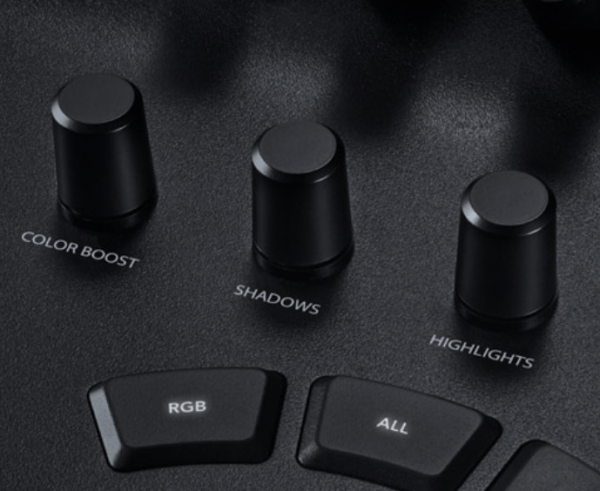
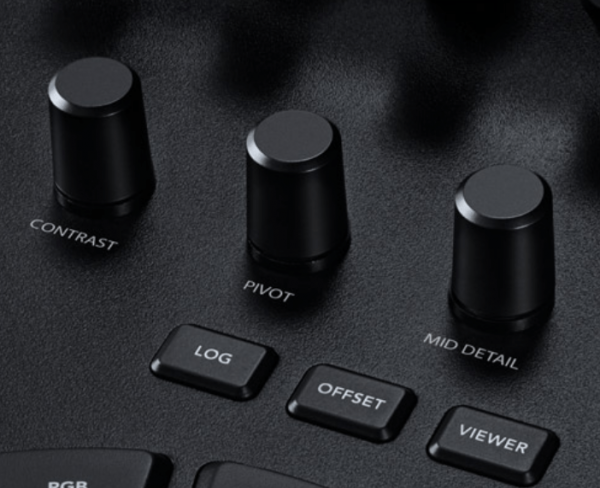
Also on the main part of the Mini Panel are the other controls it shares with the Micro Panel and the cover most of the controls that are regularly used in primary grading such as Saturation and Luma levels.
Above the playback controls are dedicated keys to move between previous or next Shot, Frame or Node. These are very useful as tuning away from the surface to move between Nodes is a particularly distracting step. I wasn’t instantly finding these without looking but it would take much practice to get used to where they are.
Going up
The real excitement for me is the upper section of the Mini Panel. This section provides control for most of the tools needed for a fully developed grade with power windows, secondaries, curves etc.
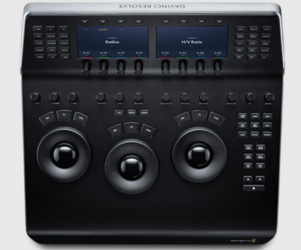
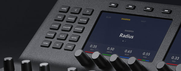
Being able to go directly to a page using the dedicated buttons is a big time saver. For example, I’m used to cycling through pages to move between primary and window controls on my other panel but if I then wanted to adjust blur then get back to the window controls it requires stopping to look carefully at the display to avoid adjusting the wrong parameters. On the Mini Panel it’s as simple as pressing the Window button to access those controls, then Blur or Primary for those pages then straight back to Window. Once again, this is an area where I was instantly saving time even as I was getting familiar with the layout and it would very quickly become a reflex action. This is another one of those things that is needed many times of on virtually every shot of every project so the few seconds it saves does add up very quickly.
Curves
One of these pages that I was less excited about was the Curves controls. The curves themselves are great but it is one of the few things that I’ve always felt works very well with a mouse or trackpad. However, the curves controls of the Mini Panel are very effective. One example of this is with a Lum V Sat curve. I know I’m not the only one who loves using this control to clean up the highlights and give the shadows a bit of boost as a way of getting a little bit more filmic look from digital footage. With the soft knobs in curves mode, the first four dials become saturation controls for blacks, shadows, highlights and whites and the dial on the far right controls the brightness position for the last one that was adjusted.
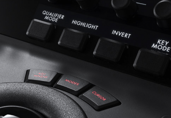
With this combination I found it so fast to adjust, eg. desaturating the whites a bit, keeping the highlights fairly neutral, boosting the shadows and then dropping the blacks back to keep the bottom end clean that I found myself doing these tweaks on shots where I would have thought twice about doing it with a mouse. Another example of the beautiful integration is that Resolve remembers what part of a page you last used. So if I was using the Lum V Sat controls in the Curves page then switched to Window and then back to Curves, it would go straight back to the Lum V Sat section of Curves. Minimising the number of button presses and how much time you need to look away from the pictures you’re grading. This also reduces the chances of accidental changes being made to the wrong parameter.
Buttons, buttons everywhere
The thought process of removing un-needed button presses is also apparent in the functioning of the buttons on the right hand side of the upper section. Another one of the most common actions in a normal grade is adding a Power Window and with the Mini Panel pressing the dedicated buttons for a rectangular or circular window also switches to the Window page for the soft knobs and soft keys.
One thing I do miss is keys to access at least some the of the grade memories. I can see why this would have been one of the difficult decisions of what to leave out in order to keep the size of the panel to something that will fit on a normal desktop but it was the only thing that regularly took my attention back to the computer keyboard and away from the panel and the screen.
DaVinci Resolve Mini Panel: final thoughts
Beyond that, I’m struggling to find anything negative to say about the Mini Panel. On our showreel grade I was working 25-30% faster than expected and this was even as I was still getting familiar with the layout of the controls. Compared to grading with a mouse, everything happens two-three times faster and this equates directly to more time to experiment, finesse or even move on to the next job.
While the DaVinci Advanced Panel is still the benchmark controller and the Micro Panel would be adequate for anyone who is mainly doing primary grading such as dailies, the Mini Panel is a superb balance for the rest of us who need to do full, complex grades quickly but can’t justify the cost or space required for the full size panel.
With the proliferation of different control surface options for grading in recent years, I hadn’t expected that there was still such a significant gap in the market. By distilling so much of what’s great about the full size Resolve panel into something that is simple, portable and affordable Blackmagic have effectively created a new sub-category of product. And from the user’s point of view, this allows us to work both faster and better.


